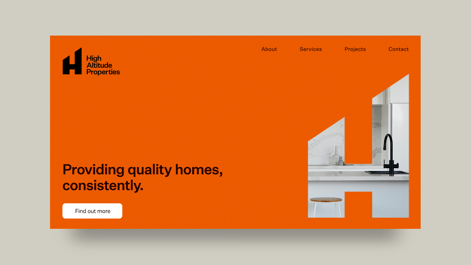
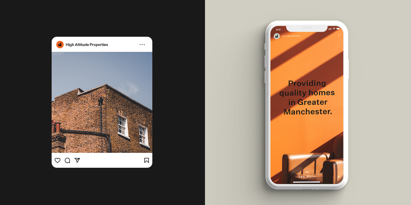
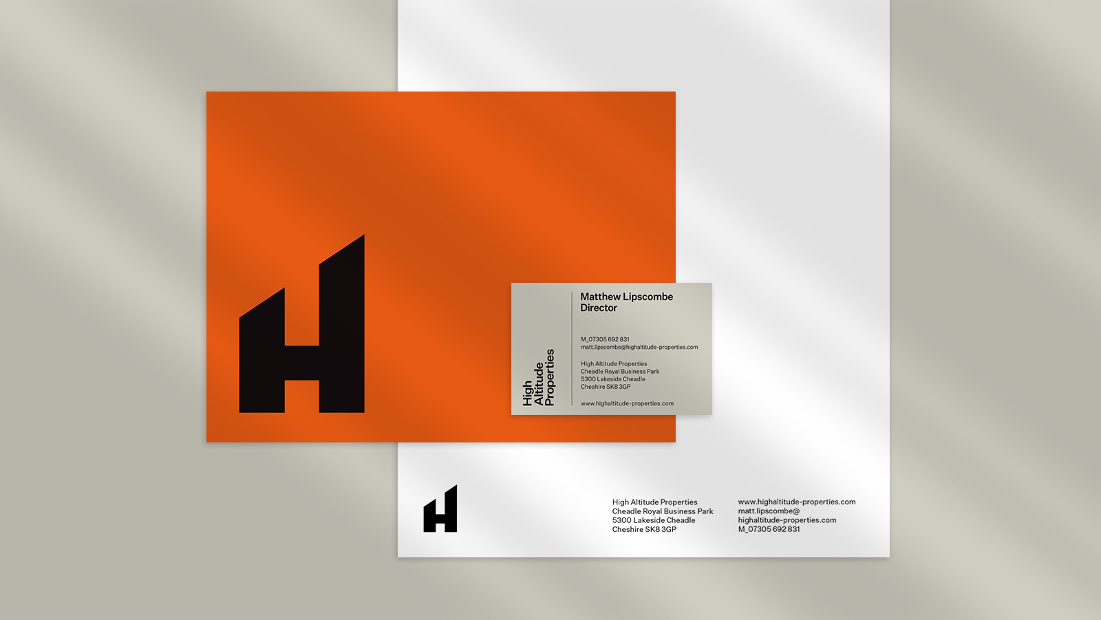
High Altitude Properties
Providing quality homes, consitently.
Providing quality homes, consitently.
Branding for Cheshire based property development company that pride themselves on quality and consistency, while providing high returns on investment.
Visual Identity. Art Direction. Website Design. Digital Experience.
Brand Positioning
High Altitude Properties delivers quality development solutions to both tenants and investors while exceeding all expectations on service and integrity.
The Solution
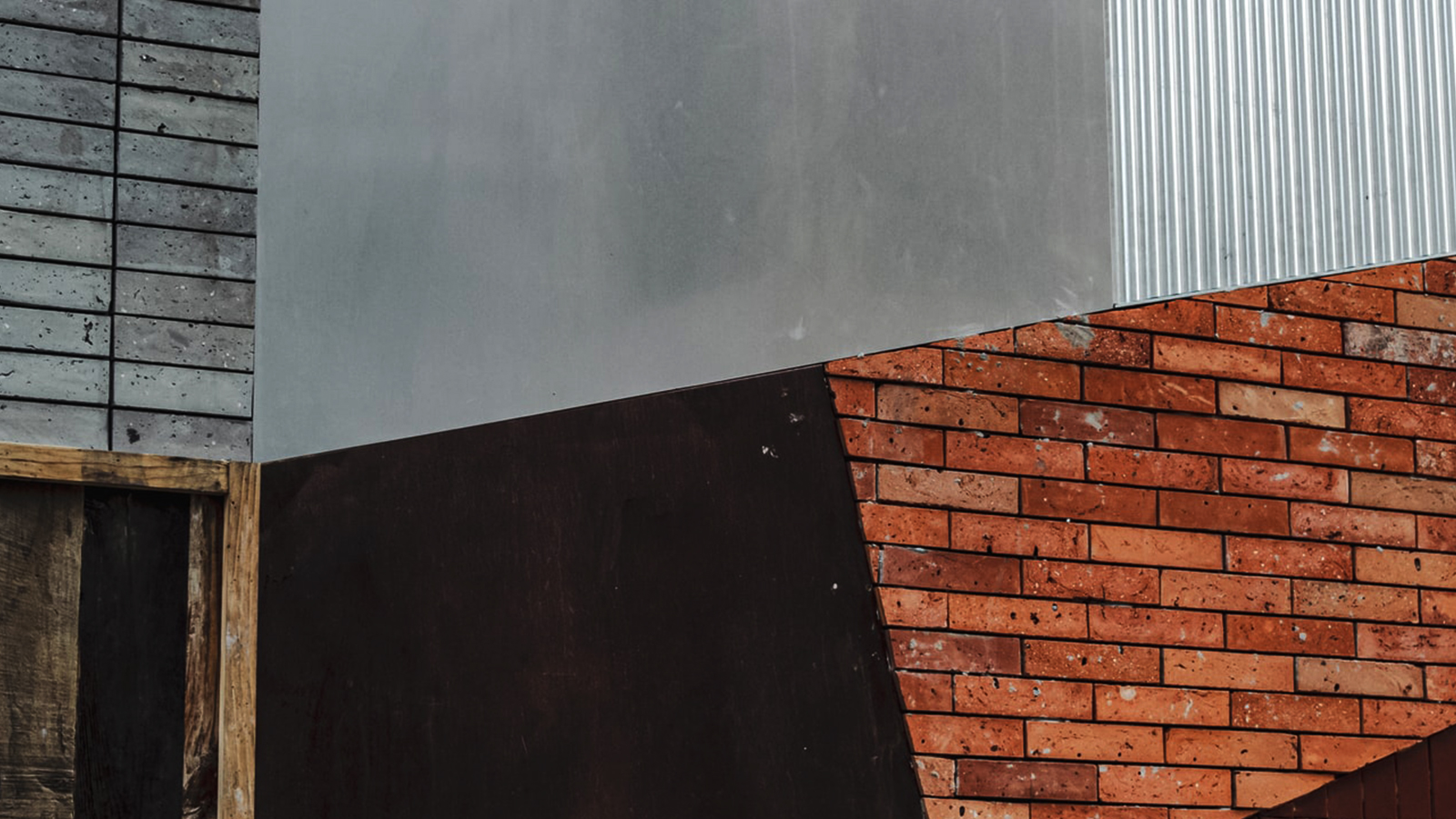
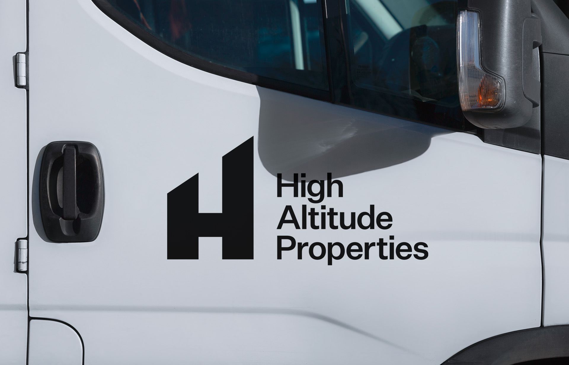
A vibrant, distinctive orange brand asset, inspired by the iconic red brick buildings found throughout Manchester. The slanted tops of the H nod to rooftops, while also aligning with the typography when stacked sideways for a cohesive and memorable visual identity.


Testimonial
“We worked with Sophie to design the branding for our property business, from our website and social media to leaflets and clothing. Sophie was great to work with and she really understood what image we were trying to convey. She provided some brilliant options for us and we are absolutely thrilled with our final design. It is professional, contemporary and exactly what we were looking for with our brand. We will continue to work with Sophie as our design requirements evolve and would highly recommend her for her professionalism and exceptional creativity.”
Matt Lipscombe
Director, High Altitude Properties